Greige: neither here nor there, but somewhere in between
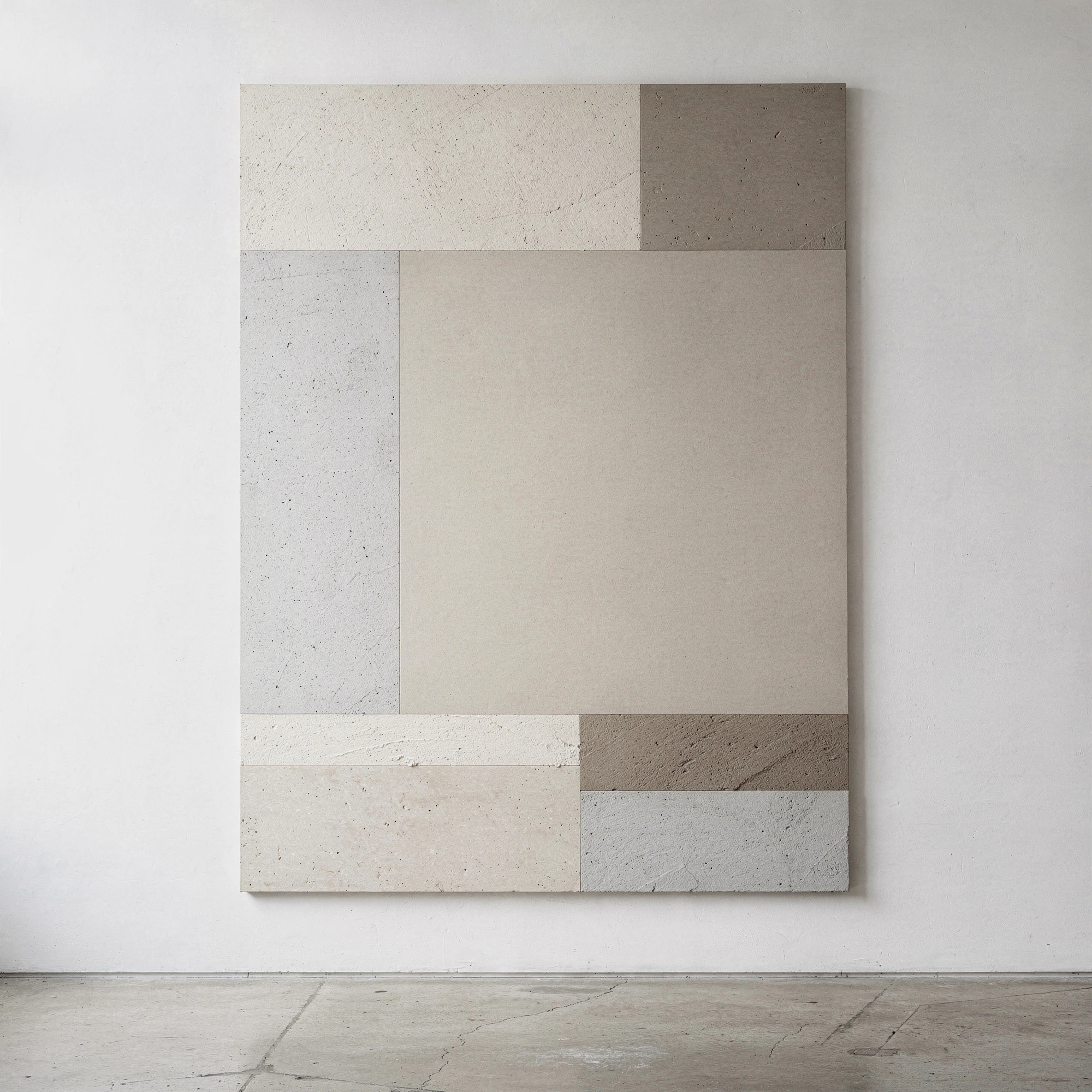
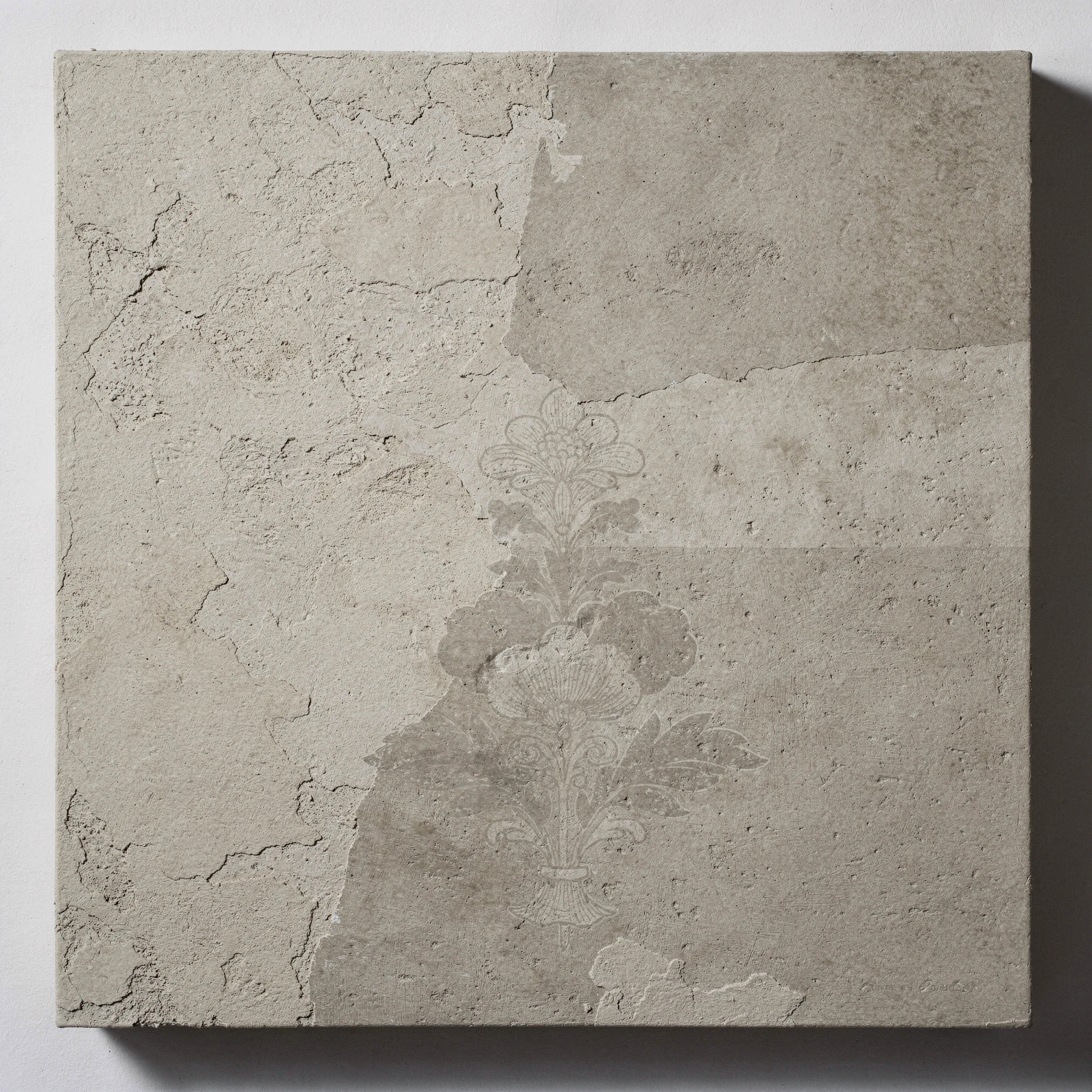
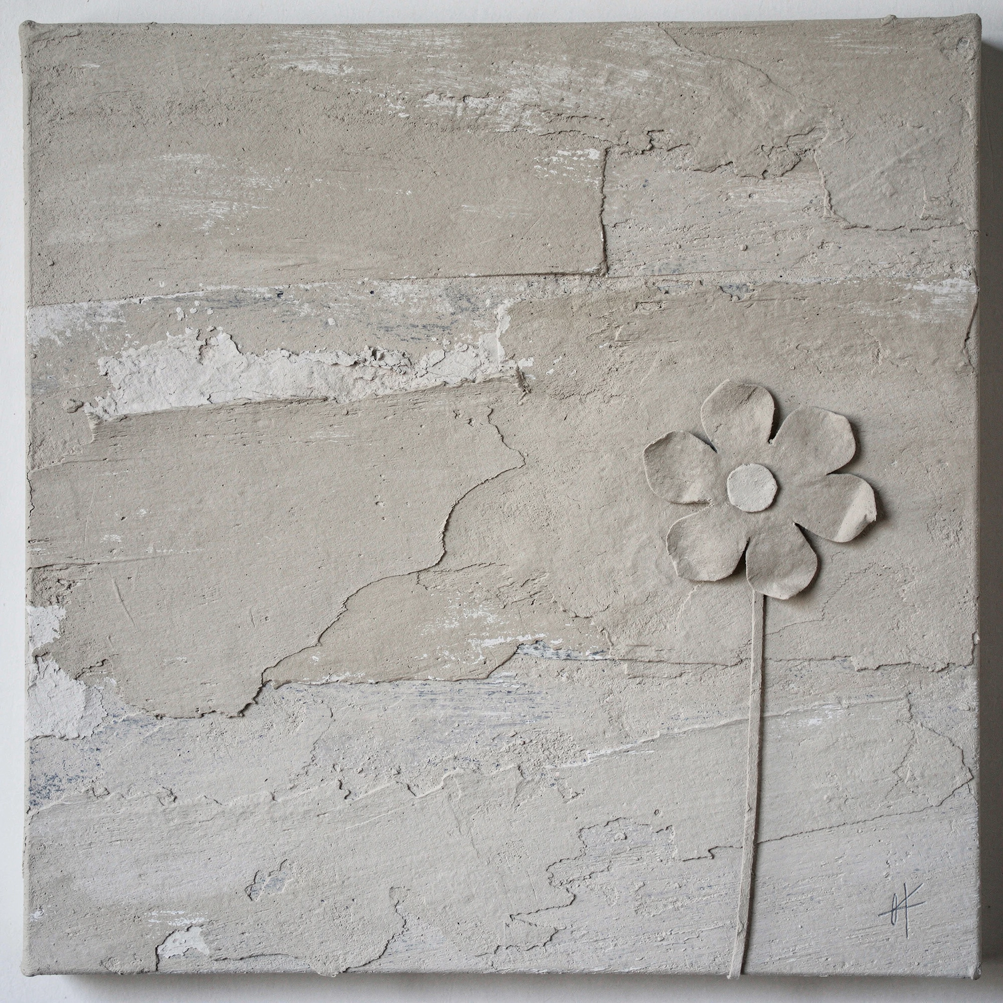
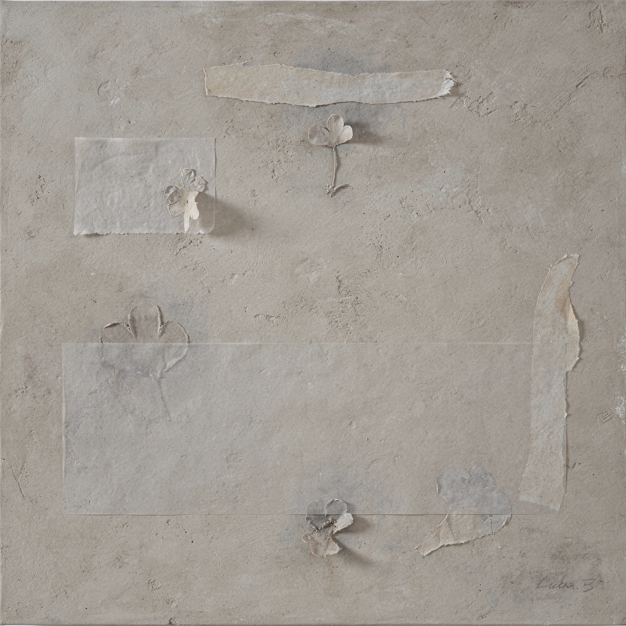
Greige is a colour caught in the act of refusing itself. Neither grey nor strictly beige, neither warm nor cool, it occupies the undecided space between architectural neutrality and domestic comfort. Appearing warmer in natural light and deeper in artificial light, it is the colour of showrooms, paint charts, upholstery samples, plaster walls, expensive restraint and tasteful compromise. Widely used in interior design and often treated as a sign of sophistication, greige is also faintly absurd: a non-colour elevated into an aesthetic position, a careful absence dressed as refinement. Its promise is calm, but its danger is boredom. It can make everything look considered, or make everything disappear.
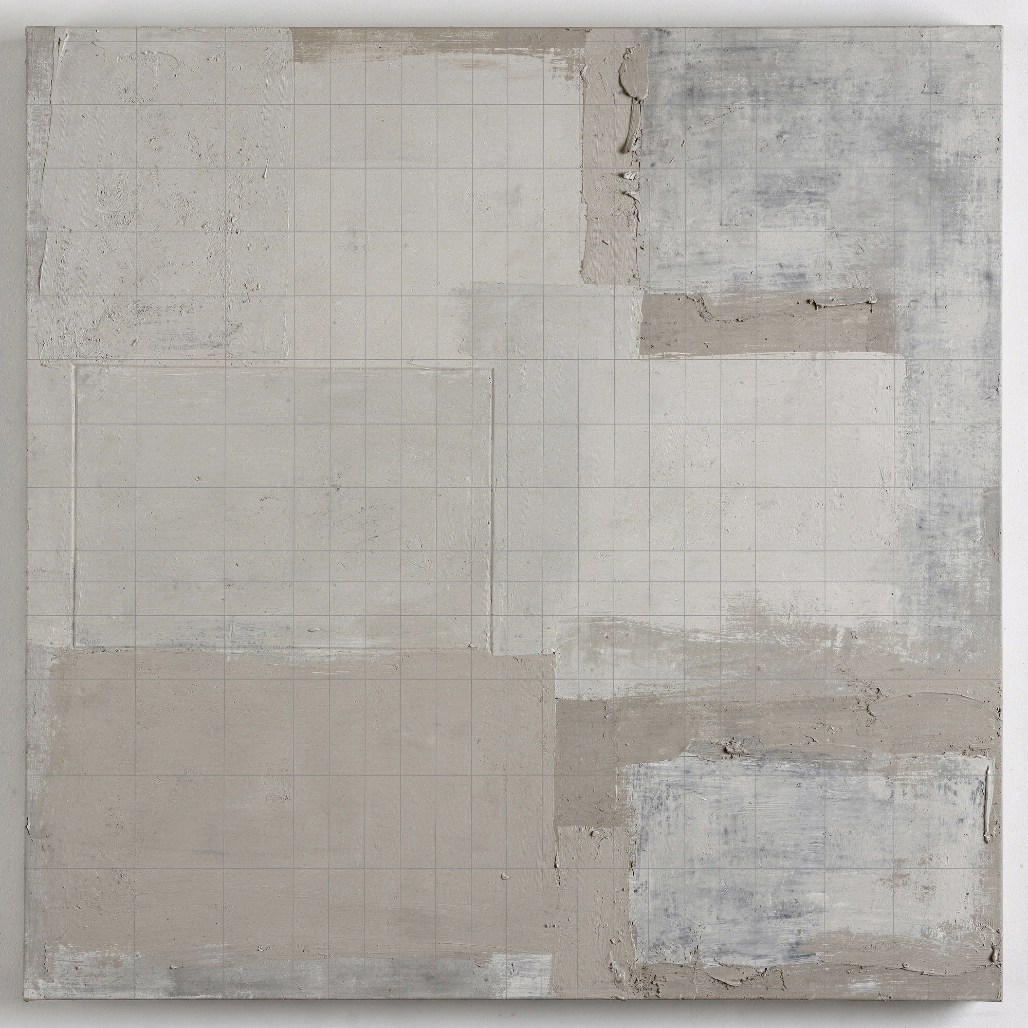
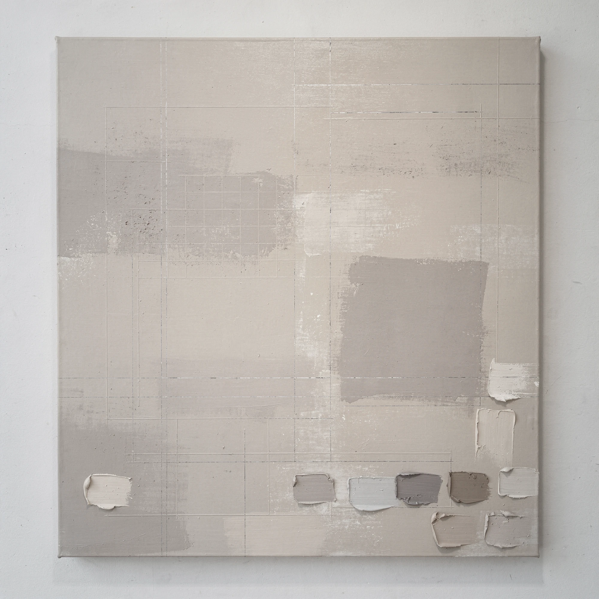
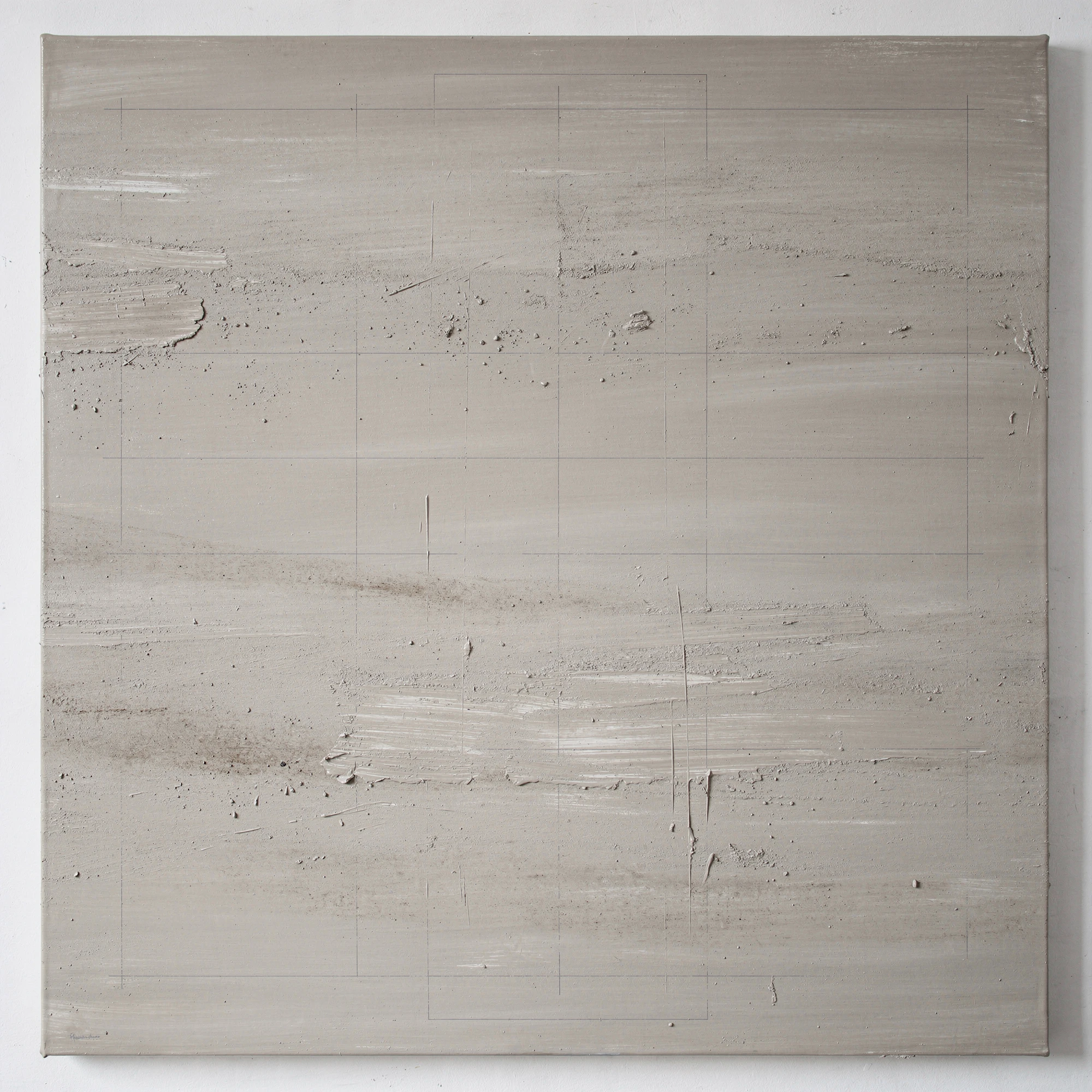
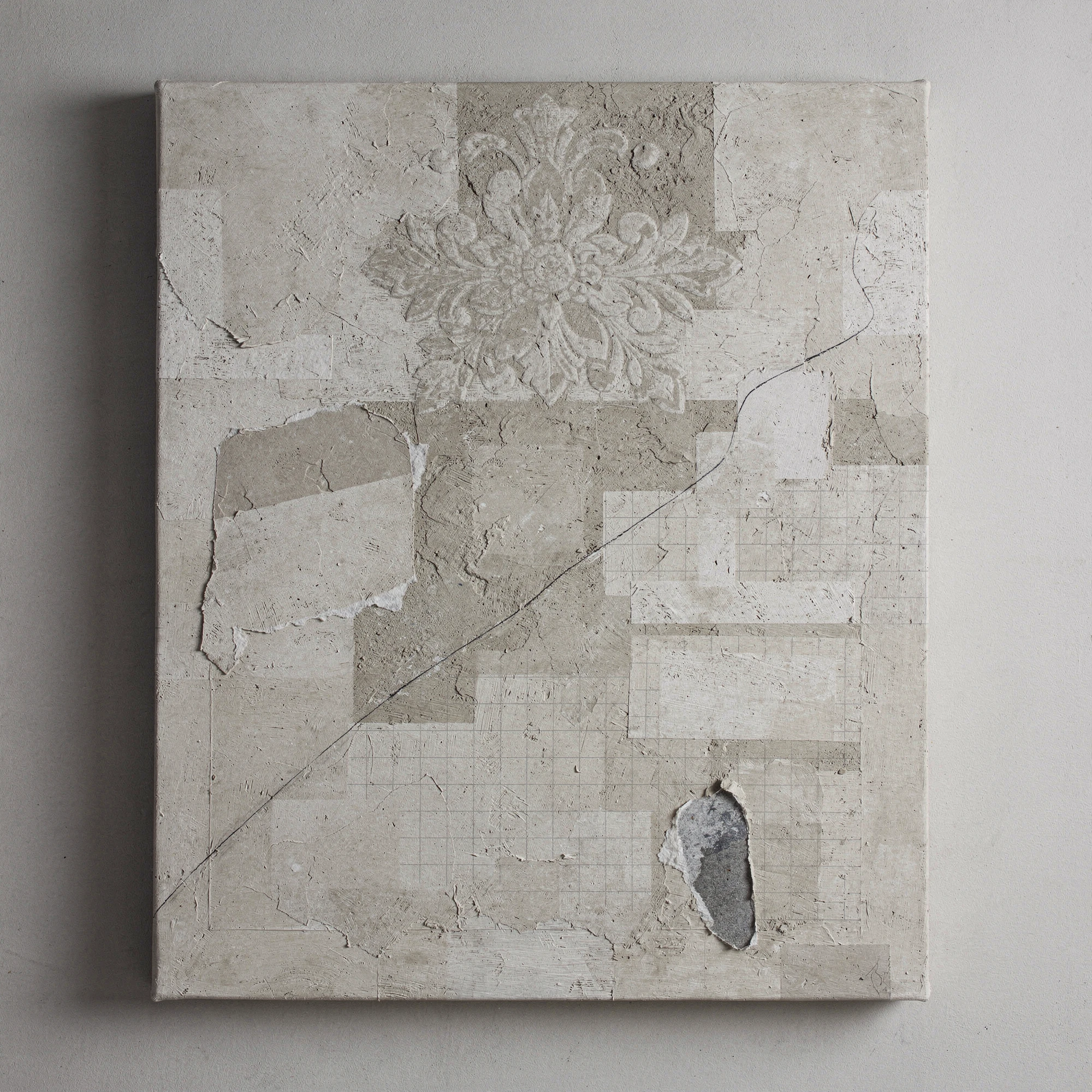
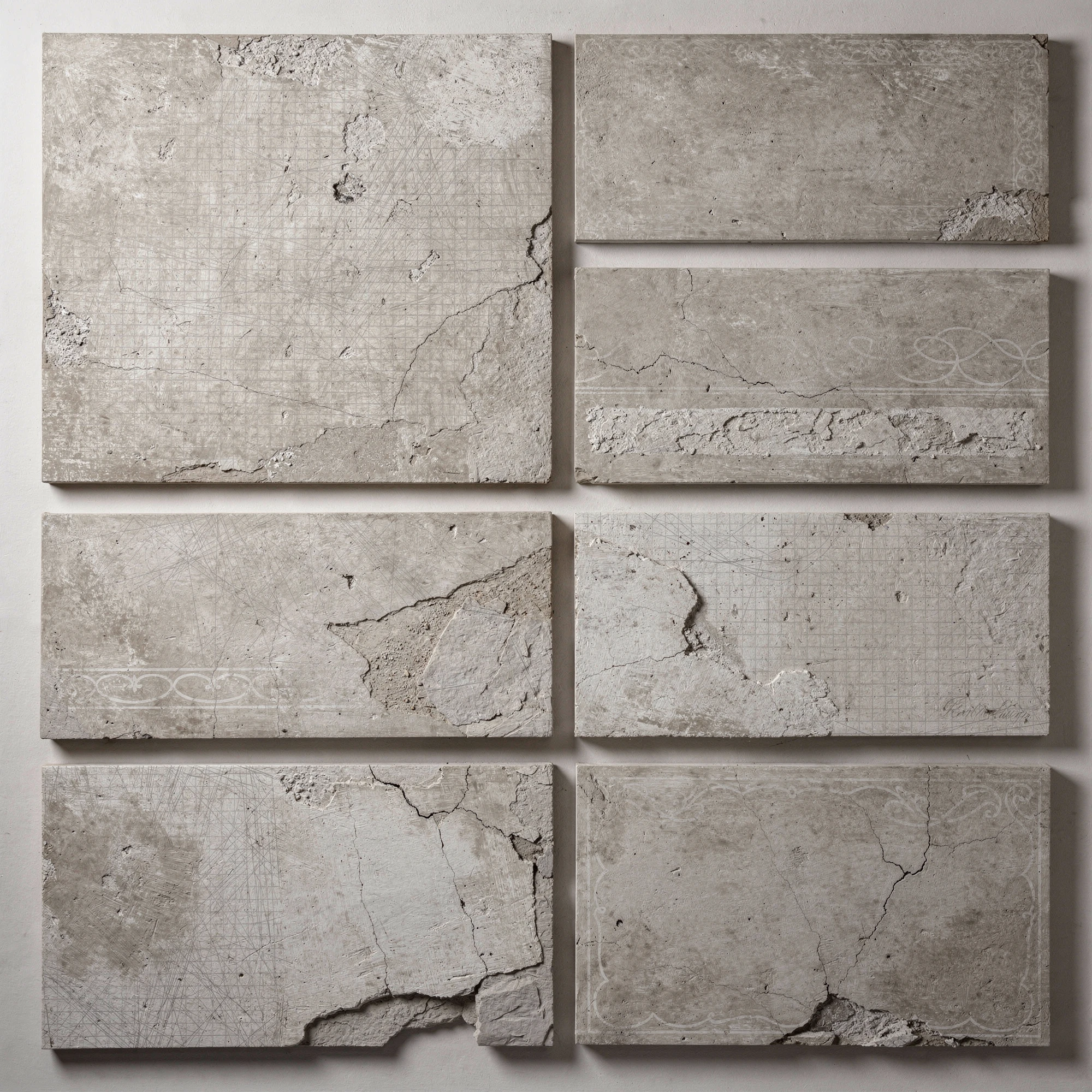
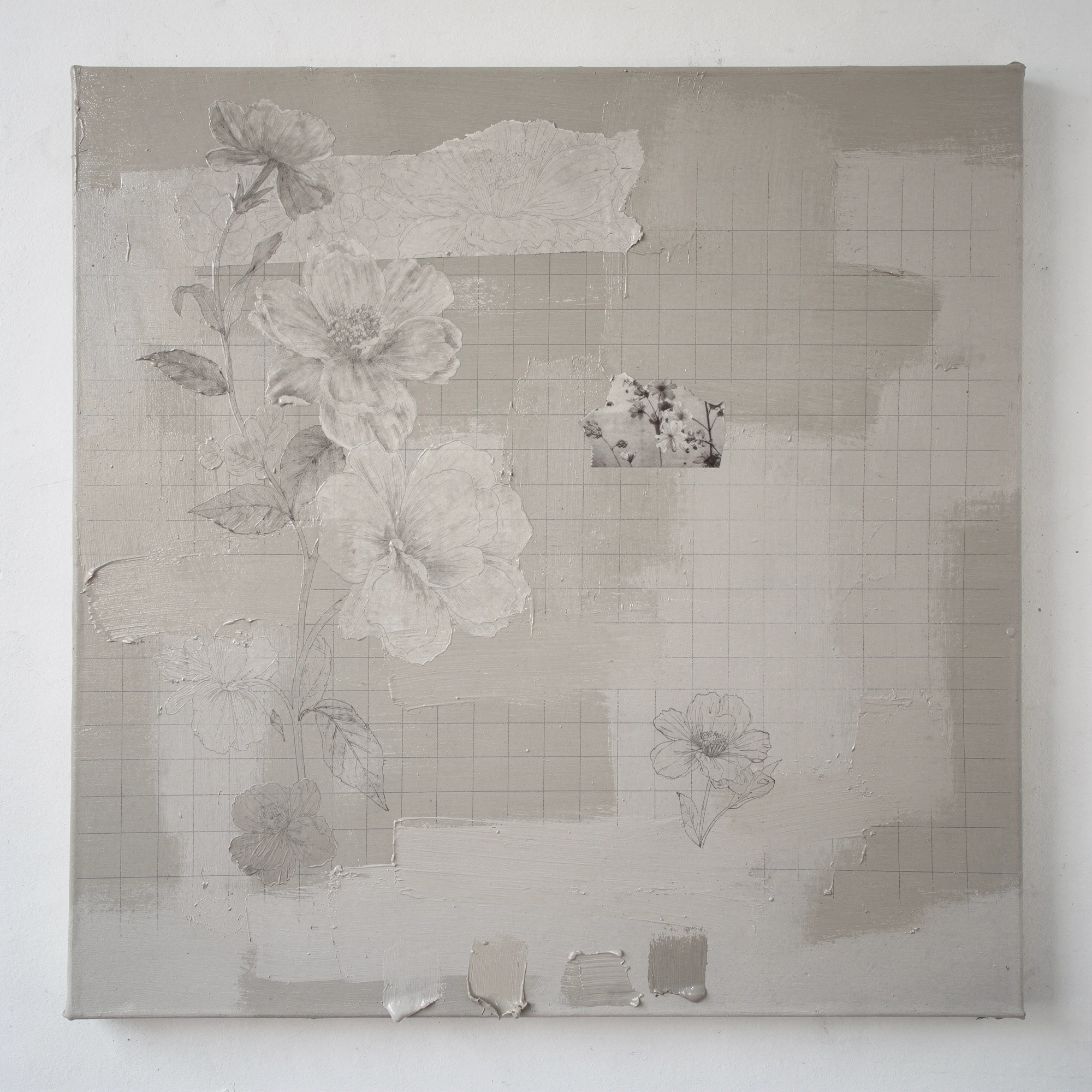
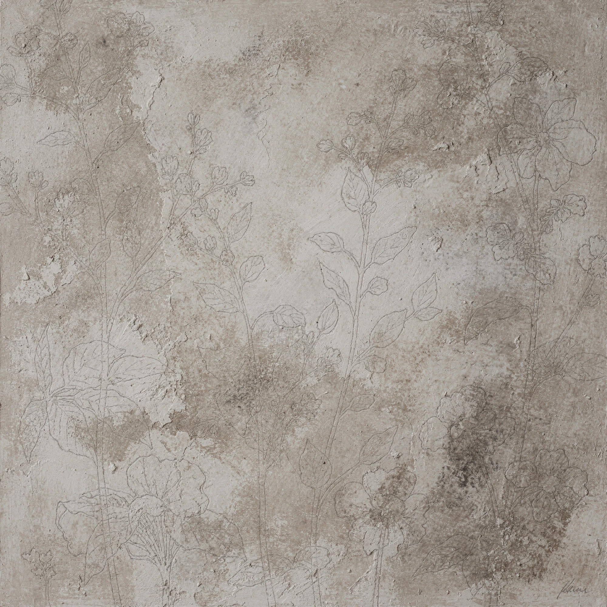
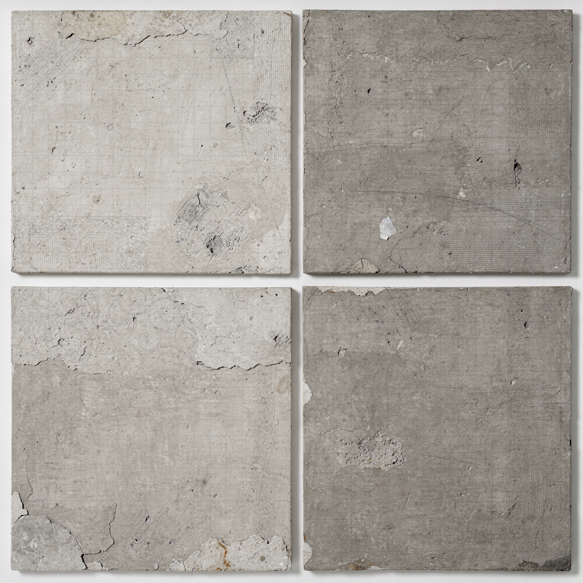
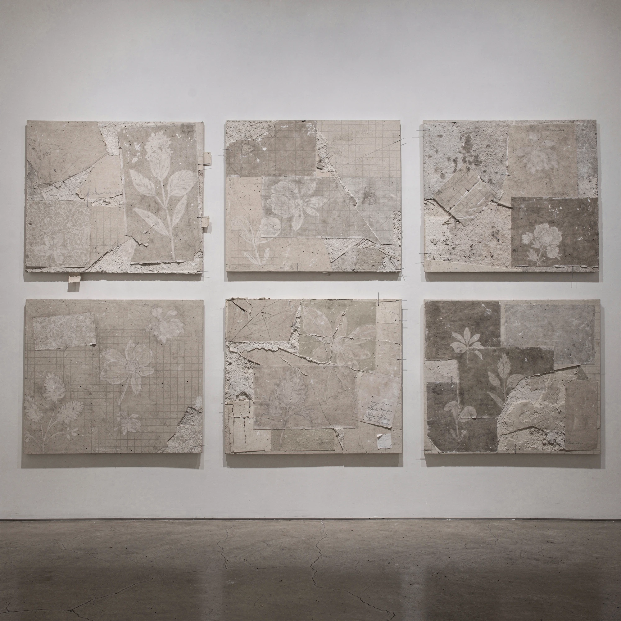
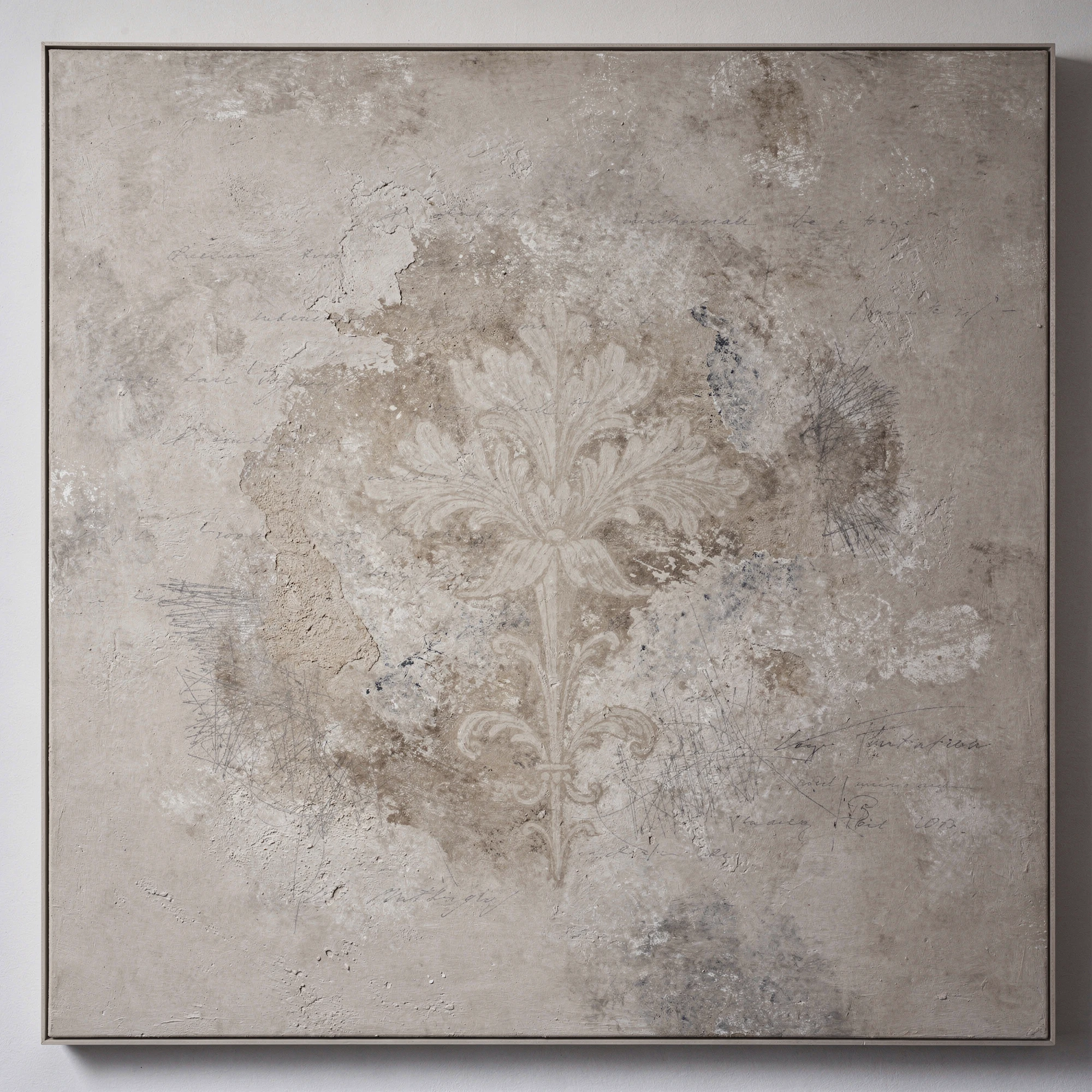
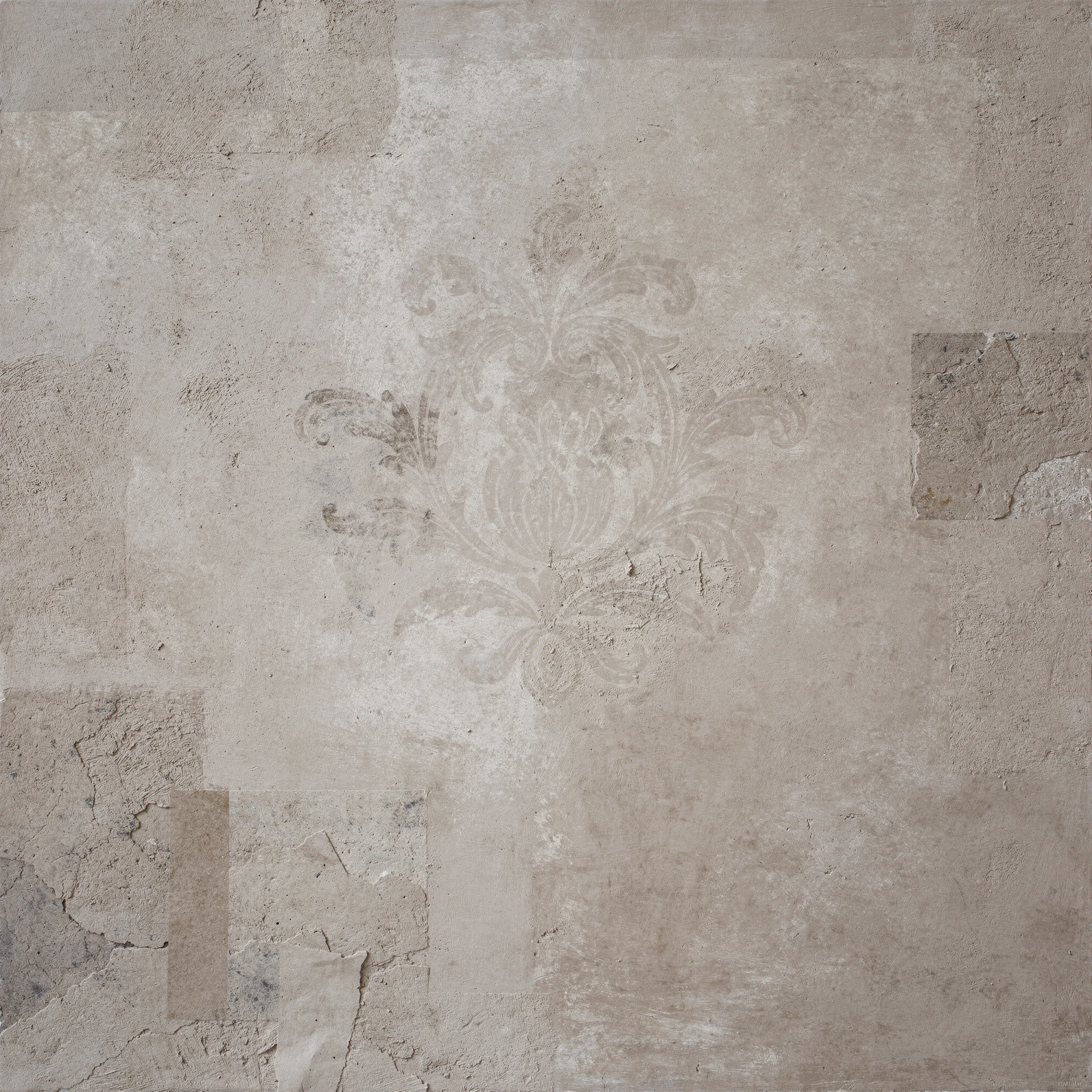
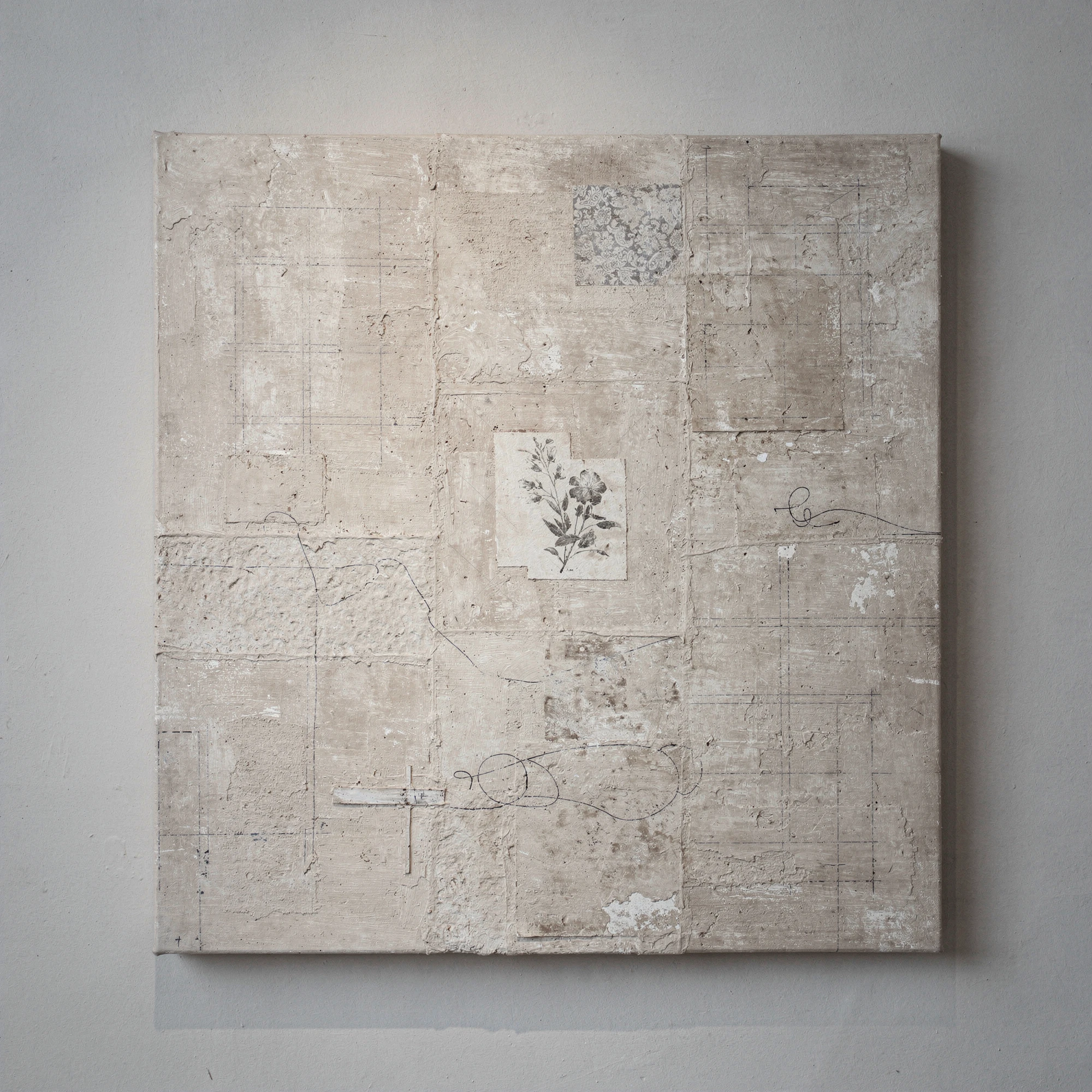
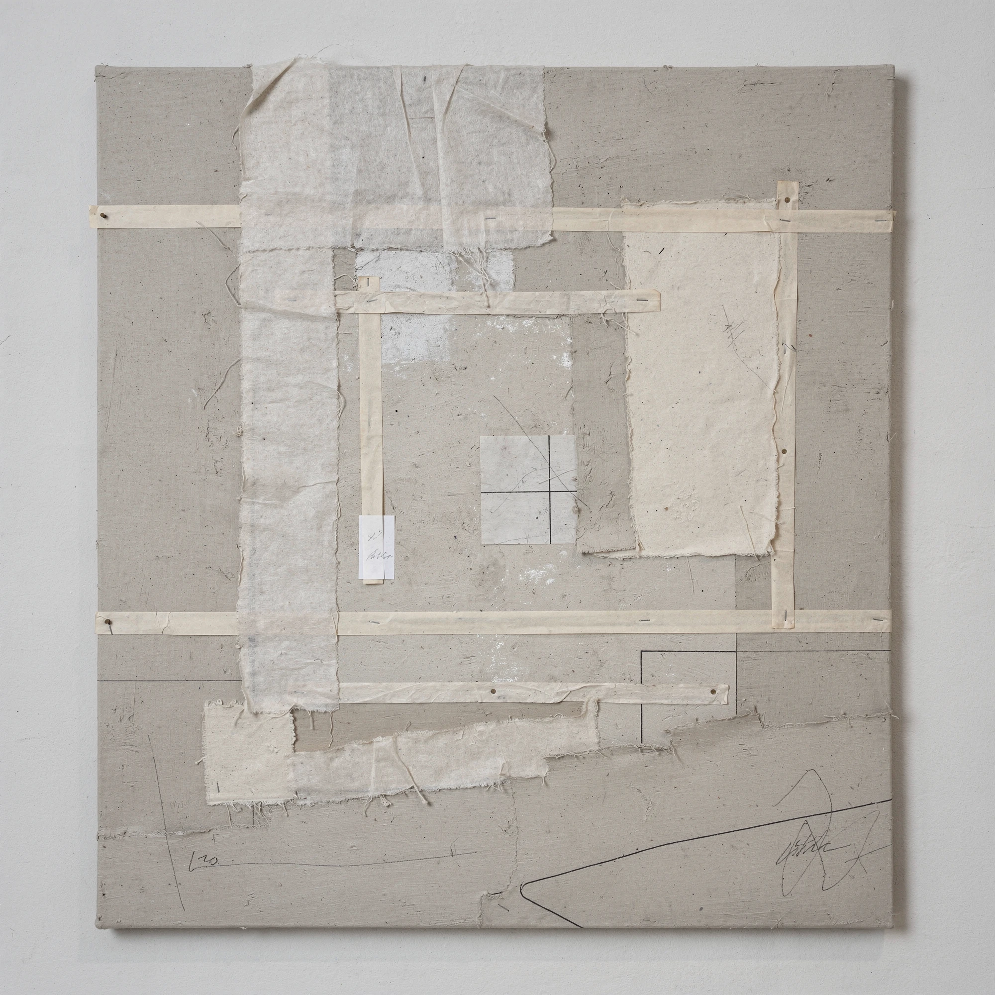
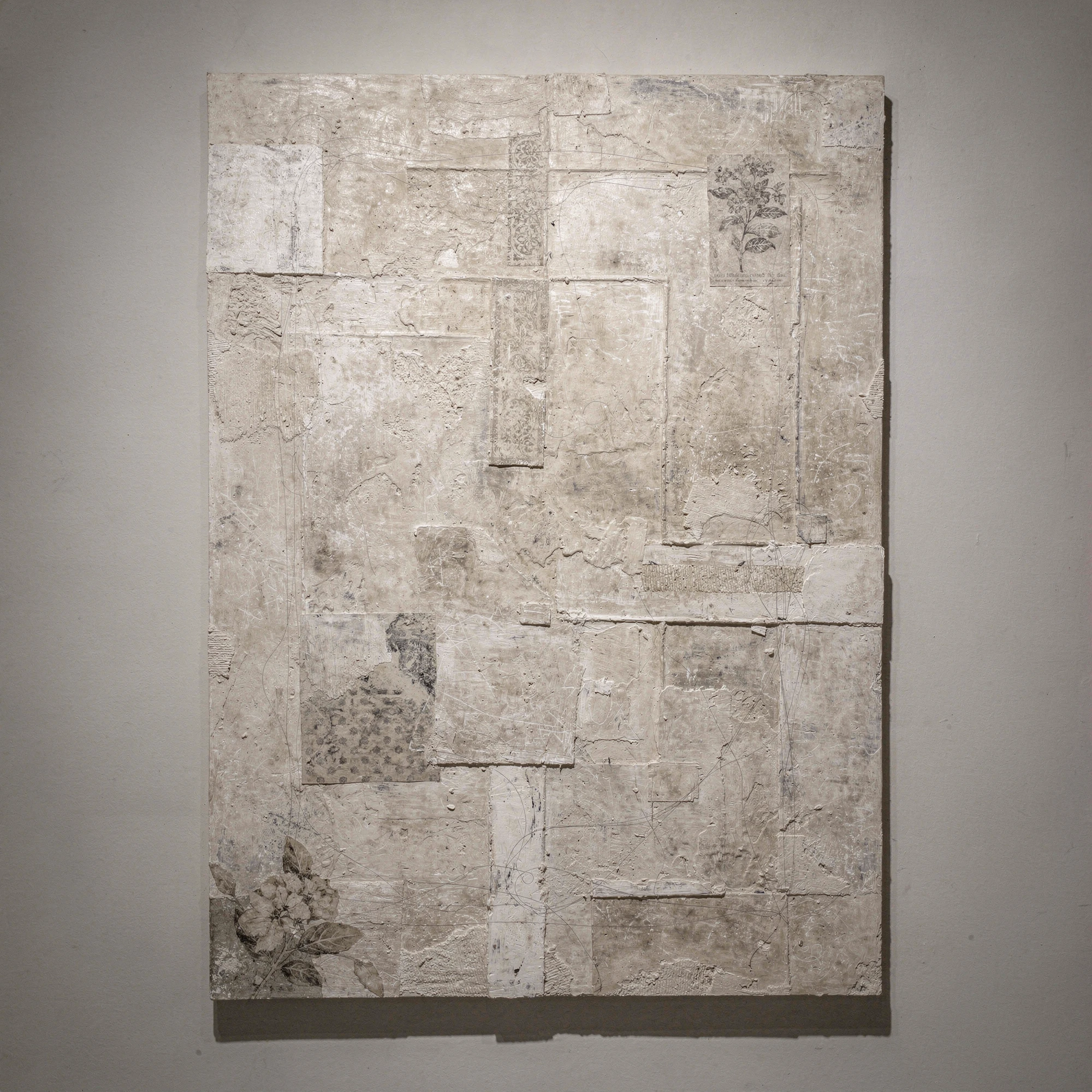
This series begins inside that risk. Working within a narrow range of grey-beige tones, the images try to make greige behave as something more active than polite background. Panels, rubbed surfaces, faint grids, paper fragments, mineral textures, graphite traces and occasional floral interventions are used to disturb the quiet without breaking it. The palette remains deliberately restricted: stone, ash, putty, plaster, mushroom, taupe, weathered grey. Colour is not expanded but compressed. Variation comes instead through surface, pressure, layering, damage, repair, edge, density and touch. The result is a kind of mixed-media fiction: images that appear to have been painted, printed, scraped, mounted, sealed or partially erased, though they exist first as synthographs.
The images in Greige sit somewhere between design discipline and painterly atmosphere. They borrow the confidence of interiors, the flatness of print, the restraint of colour-field painting and the material ambiguity of collage, but refuse to settle into any of them. The works are decorative only in the most controlled sense: ornament appears as a trace, not a declaration. What might have been bland becomes uncertain; what might have been tasteful becomes slightly unstable. Greige is not presented here as a beautiful colour, exactly, but as a problem to be handled with care — a muted field in which taste, boredom, luxury and hesitation keep changing places. The first known use of the word "greige" was in 1835. It was borrowed from the French word grège, meaning "raw, unfinished."
Gallery
"Beige is the colour of indecision." — Paula Scher